The colour scheme is surprisingly dull for a magazine called "'brass band world.' If I used this as the name for my magazine I would want to make it look fun and interesting to draw readers in.
The dull colour scheme could mean that its target demographic is people who already play brass instruments who read it to find out about the latest competition results or what's happening with the best players and bands.
The font is sans serif which make the magazine look modern and professional. This appeals to a younger demographic.
The sell lines on the cover are relatively uninteresting but are about subjects the target demographic is likely to want to know about.
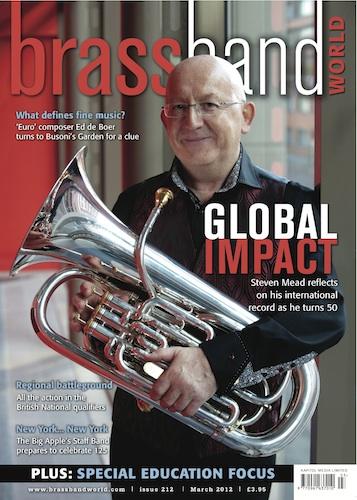
The man in the main image isn't of a young 'new' musician so the magazine has probably already established a large demographic.
 The main sell line is a pun for two reasons. Firstly the main image features a band who are dressed in an American army uniform and secondly they played a Glenn Miller set to take them to victory. The sell line is a quote from a song at the time.
The sell line font is the font typically associated with the army reinforcing what the sell line says.
The other sell lines are positioned at the bottom of the page as if they are less significant. These other sell lines are less amusing than the main sell line.
These other sell lines and the masthead are in a sans serif font making it look modern and professional appealing to a younger demographic. On this issue the modern feel is juxtaposed by the old fashioned style of the uniforms the band is wearing.
No comments:
Post a Comment